A responsive web app designed to help new buyers and small-scale investors find residential and commercial properties with ease. This case study focuses on clean UI design, responsive layouts, and creating a clear, user-friendly experience for navigating the real estate market.
First-time property buyers and small-scale investors need a fast, intuitive way to search, compare, and evaluate real estate listings. Existing tools often overwhelm users with cluttered layouts and irrelevant information, leading to frustration, lost time, and missed opportunities.
Many first-time buyers and small-scale investors struggle to evaluate properties quickly and confidently.
They often face cluttered interfaces, overwhelming filters, and unclear listing info.
This design challenge set the foundation for Landwise. I set out to create an experience that not only delivered functionality but felt streamlined and approachable to users overwhelmed by traditional property platforms.
What is Landwise?
LandWise is a responsive mobile web app designed to help first-time buyers and small-scale investors find and evaluate real estate listings quickly and confidently. The app simplifies property discovery through smart filters, intuitive navigation, and clean UI — all optimized for users on the go.
LandWise Mobile Screens
Design Goals
Simplify the property discovery experience
Support users with search, filtering, and bookmarking tools
Create a responsive UI that feels fast, trustworthy, and clear
Maintain a clean visual design with intuitive navigation
Throughout this project, my focus was on creating a solution that aligned with the behavior of mobile-first users and empowered them to explore real estate opportunities without friction.
User Persona
Understanding Rashida’s need for efficiency and clarity guided the overall UI design—from mobile-first layouts and simplified navigation to filter controls and visual hierarchy that help users like her scan, compare, and bookmark listings with ease.
User Stories
Profile Criteria
As a user, I want to create a profile containing all my property criteria so that I am recommended results most relevant to me.
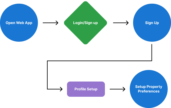
User Flow 1
Property Info
As a user, I want access to as much written and visual information as possible about properties I’m interested in so that I can make an informed decision.
User Flow 2
Filtered Search
As a user, I want to be able to search and filter properties so that I can find good matches based on my needs.
User Flow 3
Contact Agents
As a user, I want to be able to contact the right people if I am interested in viewing a property so that I can schedule a viewing.
User Flow 4
Save Listings
As a user, I want to be able to save or mark properties I’m interested in so that I can easily revisit them.
User Flow 5
Compare Options
As a user, I want to see how well a property meets my criteria or compares to other properties so that I can refine my options.
User Flow 6
These user stories translated directly into features and UI decisions. Every screen was built to support one or more of Rashida’s core needs.
Designing for Discovery
Iteration 1
From Low-Fi to Mid-Fi
Introduced proper grid for property cards
Added placeholder text blocks for structure
Refined placement and hierarchy of the search/sort/filter bar
From Mid-Fi to Hi-Fi
Refined visual hierarchy and alignment
Enhanced visual clarity of icons and added active states for better usability
Added Save Search and View Map buttons for functionality
Each design iteration enhanced visual organization, making it easier for users like Rashida to browse listings quickly and make informed decisions.
Iteration 2
From Low-Fi To Mid-Fi
Added structure to content blocks (price, features, agent contact)
Replaced text-heavy layout with labeled sections for quick scanning
From Mid-Fi To Hi-Fi
Introduced color, icons, and consistent spacing
Designed clear CTA buttons (Call Agent, Message Agent)
Optimized layout for mobile readability and usability
Each step brought the screen closer to supporting users like Rashida, who need to scan property details quickly and act with confidence.
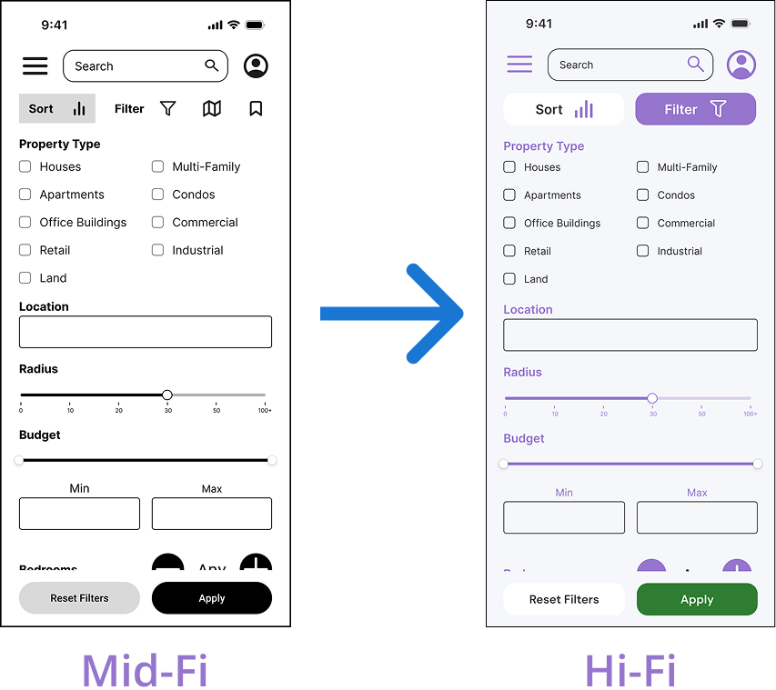
Iteration 3
From Low-Fi To Mid-Fi
Clarified section headers and input styles (dropdowns, sliders)
Organized filters into logical groups to reduce visual clutter
Switched to horizontally-aligned sliders and improved spacing
From Mid-Fi To Hi-Fi
Finalized iconography and spacing for consistency
Styled form elements for better contrast and tap targets
Refined styling of Reset and Apply CTAs for better visibility and usability
These changes made filtering faster and more intuitive. A clean layout with sliders and toggles helped users like Rashida fine-tune their search quickly and with ease.
Design Dcumentation & Responsive UI
Style Guide
A well-defined visual system creates clarity and trust in a complex product like real estate search. For LandWise, I established a consistent set of UI components, spacing rules, and typography styles to support a clean, responsive interface that adapts smoothly across devices and maintains usability at every breakpoint.
Logo
LandWise Logo
The Landwise logo combines a house shape with a lightbulb cutout to represent smart, informed property decisions. It reflects clarity, guidance, and confidence in real estate investing
Color Palette
LandWise Color Palette
The LandWise color palette is designed to inspire clarity, confidence, and trust for new and small-scale property buyers.
The soft background shade creates a clean, airy foundation for every screen, while the container white brings structure to cards and UI components. The deep green primary anchors core actions and CTAs, signaling growth, trust, and reliability. The bold blue accent is used for links and interactive elements, offering a subtle visual nudge to guide user navigation. The soft purple secondary introduces a confident, tech-forward tone, especially in icons and supporting visuals. Together, these colors support a calming, clear interface that aligns with LandWise’s mission of empowering smart, stress-free real estate decisions.
The deep green primary anchors core actions and CTAs, signaling growth, trust, and reliability.
The bold blue accent is used for links and interactive elements, offering a subtle visual nudge to guide user navigation.
The soft purple secondary introduces a confident, tech-forward tone, especially in icons and supporting visuals.
Together, these colors support a calming, clear interface that aligns with LandWise’s mission of empowering smart, stress-free real estate decisions.
Typography
Typography
The visual language reinforces the brand’s values — clarity, confidence, and calm. The chosen color palette and DM sans-serif typeface create a professional yet approachable aesthetic.
Responsive UI - Multiple Breakpoints
Mobile, Tablet and Desktop Breakpoints
The design adapts smoothly across devices to support users like Rashida, who switch between mobile, tablet, and desktop.
Final Thoughts
Designing LandWise challenged me to think critically about how layout, visual hierarchy, and responsiveness shape user confidence—especially in a high-stakes space like real estate. This project helped me refine my ability to create clean, scalable UI systems that adapt across devices while staying intuitive and accessible. Moving forward, I’m excited to bring this clarity-first mindset to more complex platforms, and continue growing as a designer who values both structure and empathy in every interface.